Alexandre da Cunha's concrete mixer bolide sculptures


Alexandre da Cunha in front of his work

I only wish you could wear the hat canvas, like in Tunga's performance for Documenta X, Inside out, upside down (Ponta Cabeça), 1997, more on it here


and also on view until September 23, Alexandre da Cunha's 'Compass' at Ham House and Garden in Richmond, outside London, where visitors are encouraged to interact with and become part of the art by climbing the sculpture
Alexandre da Cunha
Full Catastrophe
31 Aug 2012 - 03 Oct 2012
Thomas Dane Gallery is pleased to present an exhibition of new works by British-Brazilian artist Alexandre da Cunha (b. 1969). Da Cunha’s Full Catastrophe will unveil two new bodies of work across both gallery spaces, and will reaffirm the artist’s unparalleled talent for transforming everyday manufacturing or leisure artifacts into intriguing artworks, echoing the aesthetics of 20th century South-American sculpture, Arte Povera, and elements of Surrealism. Whether it is old mop-heads, jars, rugs or ironing boards, da Cunha casually turns the ‘ready-made’ system of belief into a pleasurable game and a poetry of materials.
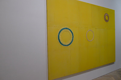
In the first of the two spaces, a series of hats emerge from the surfaces of ‘pseudo-paintings’. Collaged, stitched and arranged on stretched canvases made from traditional painters’ linen, dustsheets or even beach towels, the hats awkwardly disrupt the formality of the flat surface of the canvas. They examine the sculptural form of the traditional support system employed by painters – the stretcher - and come as close to painting as the artist could ever venture without actually picking up a paintbrush or mixing paint. At first glance the hats, cliché beachwear, are not recognisable. Presented at an unusual angle to the viewer and with their rims sewn flat to the canvas, they first appear as magnified skin blemishes or nipples, simultaneously grotesque and titillating. With their general title, Nudes, the works play on a flirtatious coyness on the semi-transparent surfaces and tropical stereotypes.
In the second space transformed concrete mixer drums have been detached from their mixer mechanisms and displayed as if archaeological discoveries - a pertinent play on the tradition of using found objects as art. The drums themselves, battered, worn and patinated, allude to the manual labour and building processes for which they were originally intended. The simple yet fundamental importance of a humble concrete mixer has been dignified to the high status of artwork (or antique artifact) thus calling in to question the whole status hierarchy. Da Cunha has used concrete extensively in previous works, from short sections of giant concrete pipes to upended concrete public benches. The absence of actual concrete in Full Catastrophe is significant. The mixer drums refer to it whilst simultaneously resisting being purely art objects themselves.
Da Cunha will be one of the key featured artists in this year’s Sao Paulo Biennial (7 September – 9 December, 2012). The artist also has a major outdoor work ‘Compass’ on display in the grounds of Ham House, Surrey until the end of September. Along side the exhibition in London, a new survey publication on the artist with a text by Zoe Gray will be published by Cobogo in September 2012.
Da Cunha was born in Rio de Janiero in 1969 and lives and works in London. He has exhibited widely throughout the Americas and Europe and is included in major collections around the world including Tate (UK), Inhotim (BR) and Cisneros Collection (USA). Most recently he has had solo presentations at CCA Wattis Institute for Contemporary Art, Camden Arts Centre and CRG Gallery (NYC).


